The Problem
Blerter pivoted from H&S management to event management. All tasks in To Do were sorted by priority only, with no way to filter by specific event. On event day, users were distracted by tasks from other events. The filter option was inaccessible, placed left of the search bar and not looking actionable.
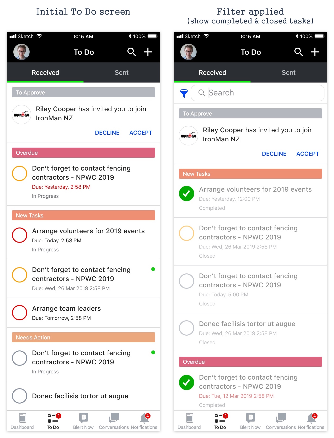
Solution
Tasks sectioned by events and personal tasks, ordered by: Personal Tasks, Current event, Earliest Start Date, Latest Start Date, then alphabetical. Filter options shown when search is initiated. Users can search by keywords, filter by events, and change task status in one place. Priority colours given more visual weight.
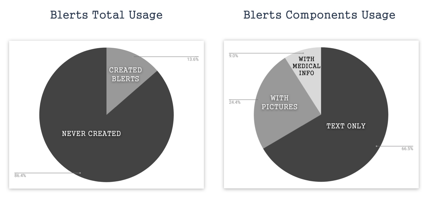
Data Analysis
Data showed 86.4% of users were not actively using the Blert feature. 66.5% of Blerts were text-only. User feedback confirmed: "Using Blert to report and its response time are slow."
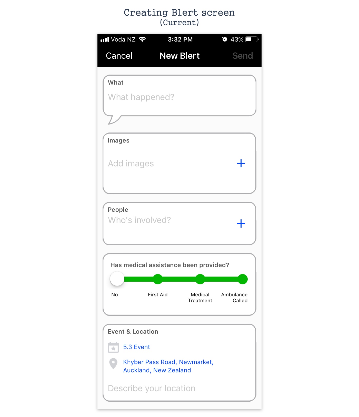
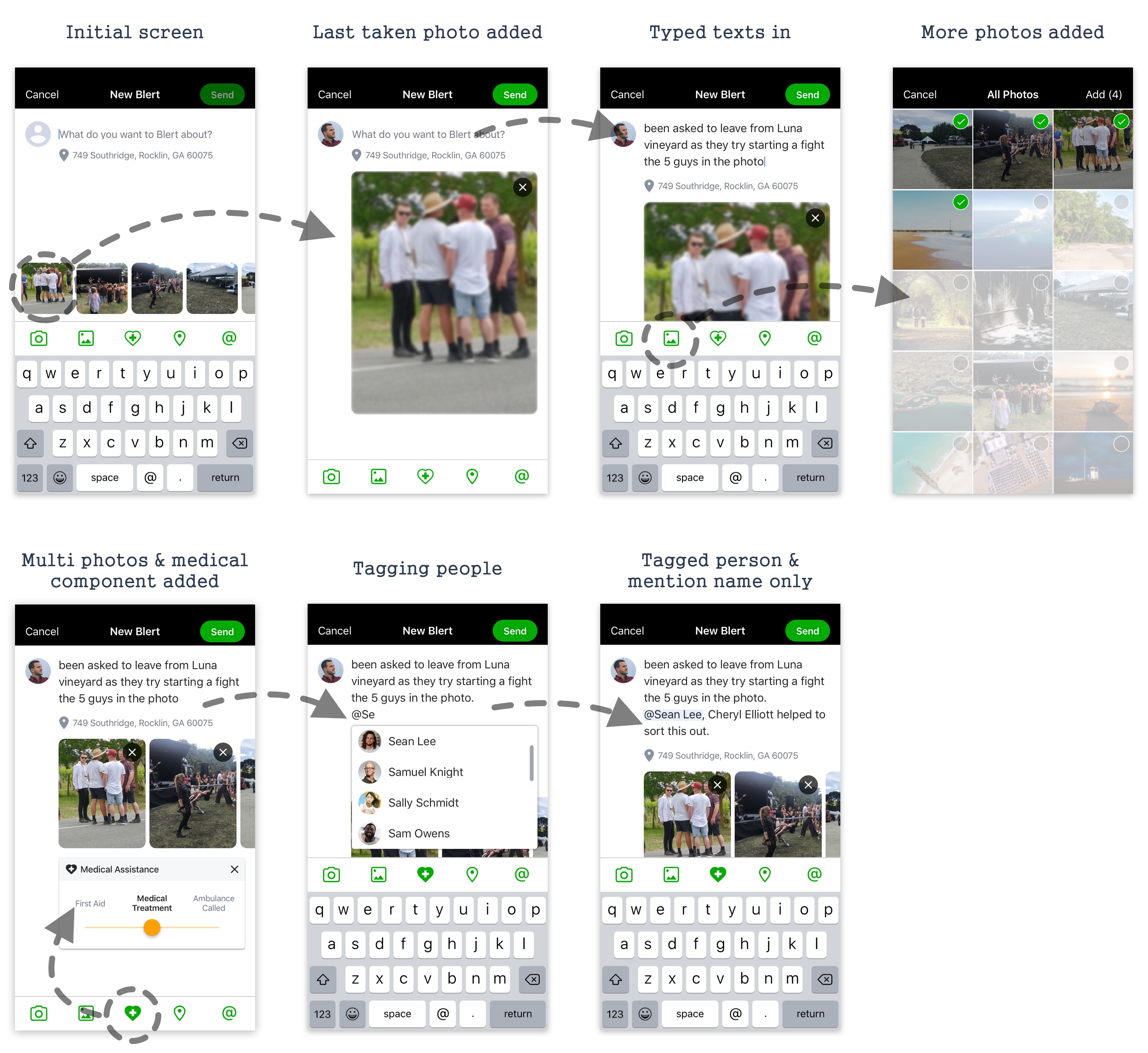
Problem
The screen showed all optional fields by default, making users think every field was required. In time-critical event situations, this caused unnecessary friction.
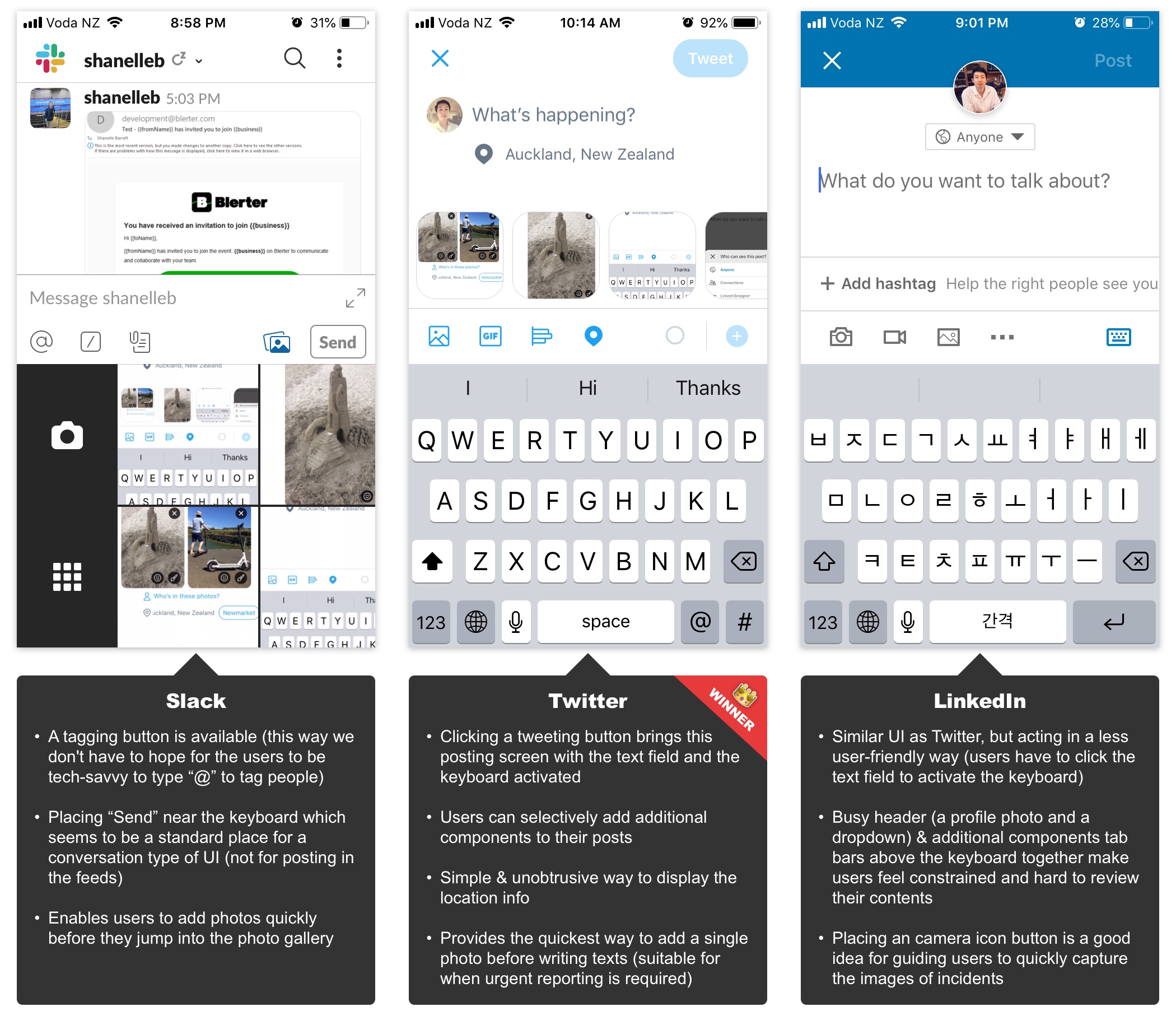
Product Research & Solution
Researched posting components in Twitter, Slack, and LinkedIn. Concluded: Twitter's base UI + Slack's tagging + LinkedIn's camera icon was the best approach for time-critical, non-tech-savvy event volunteers.
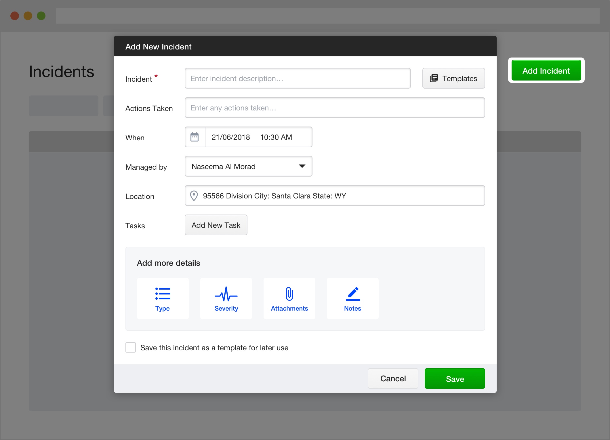
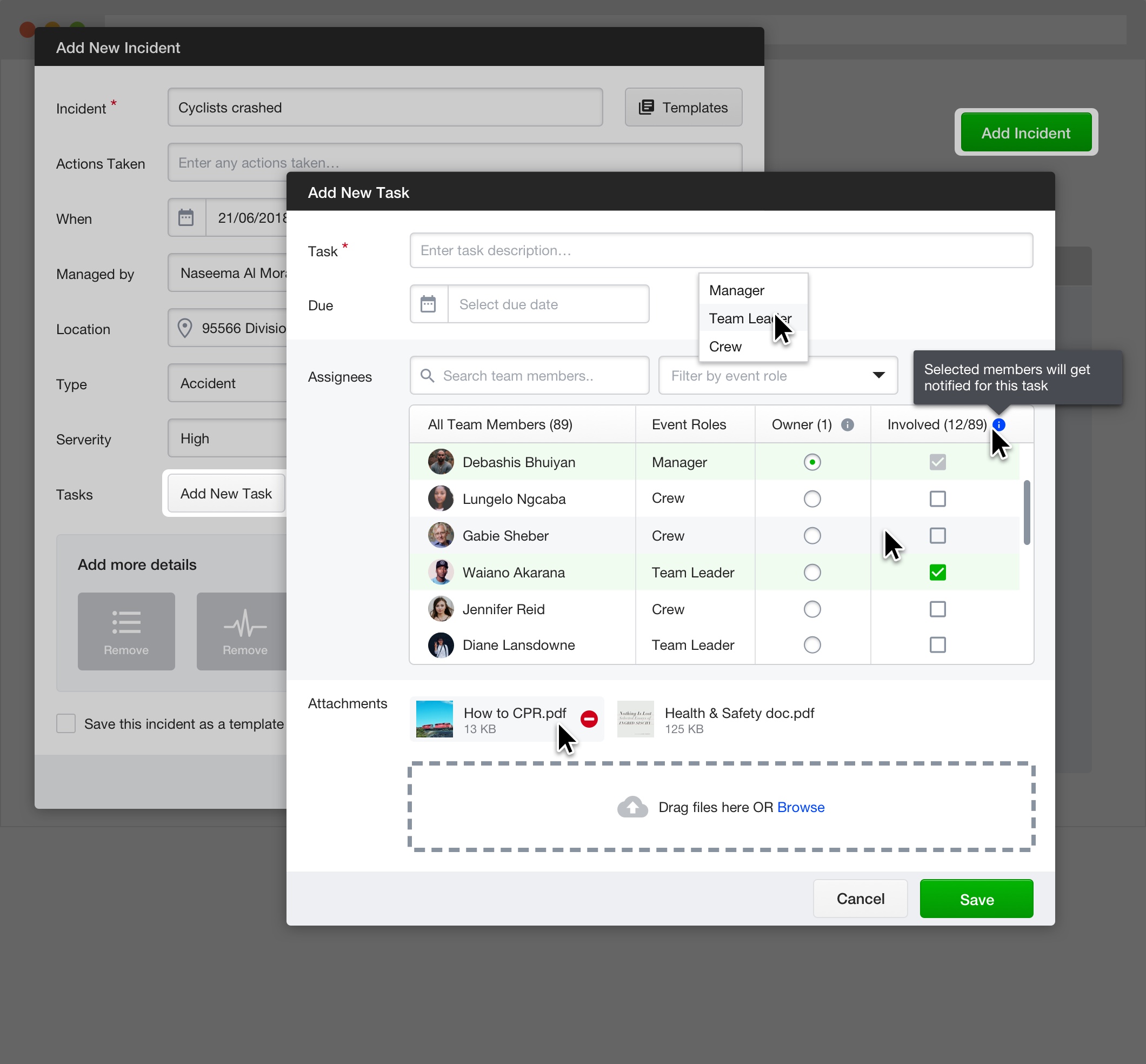
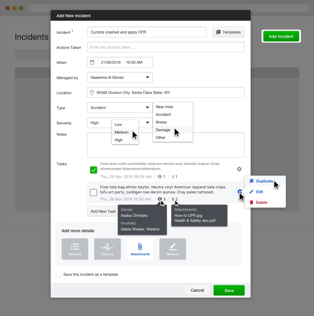
The Problem
Customers found incident reporting too difficult. Categories were not always applicable, and too many steps were needed for quick capture. Documenting all incidents is critical for H&S compliance and legal protection.
User Feedback
Most incidents created on event day, within the event area
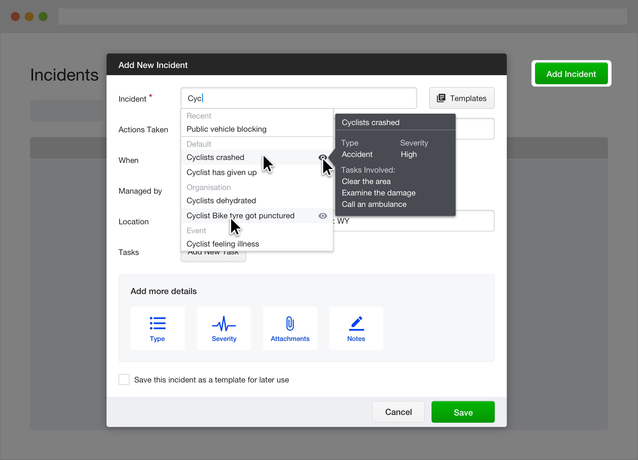
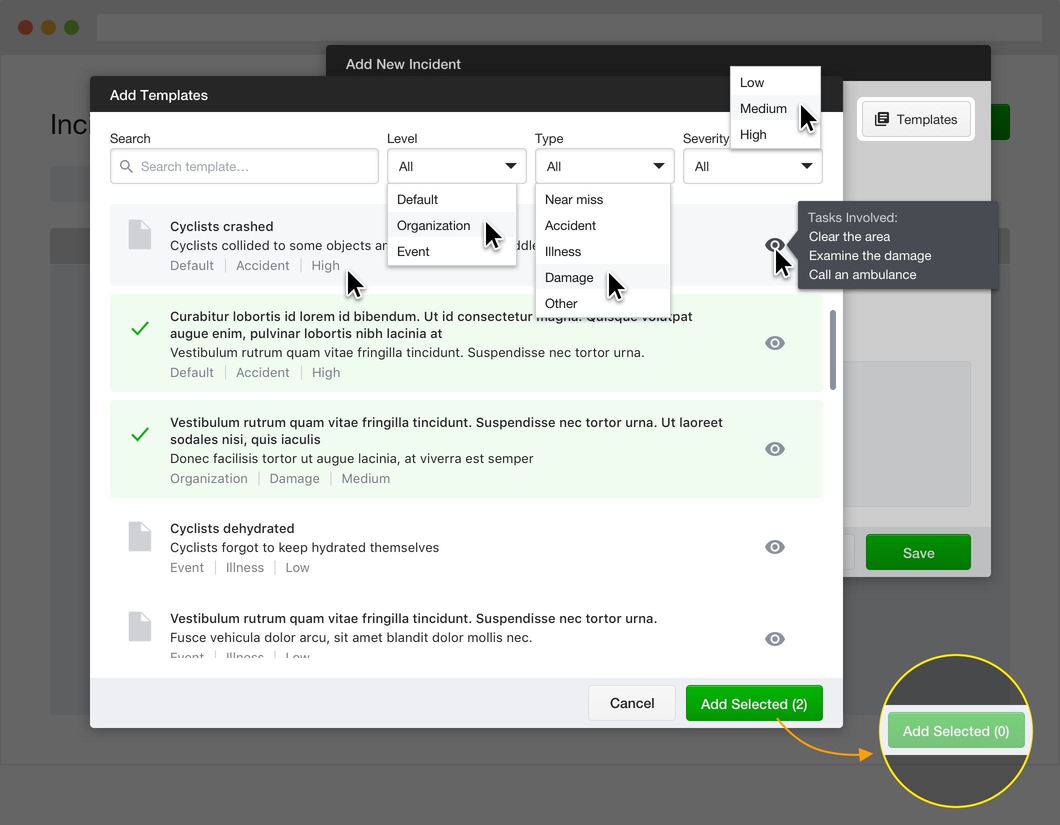
Templates created before event day during planning stage
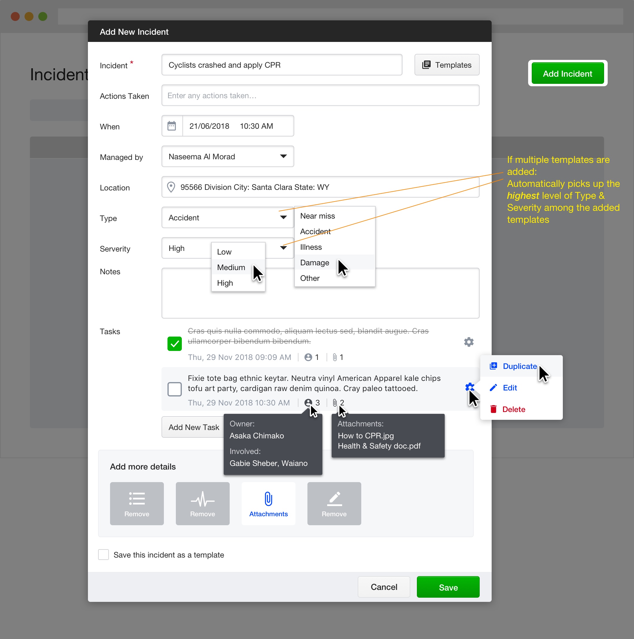
Quick capture needed: brief record first, details added later
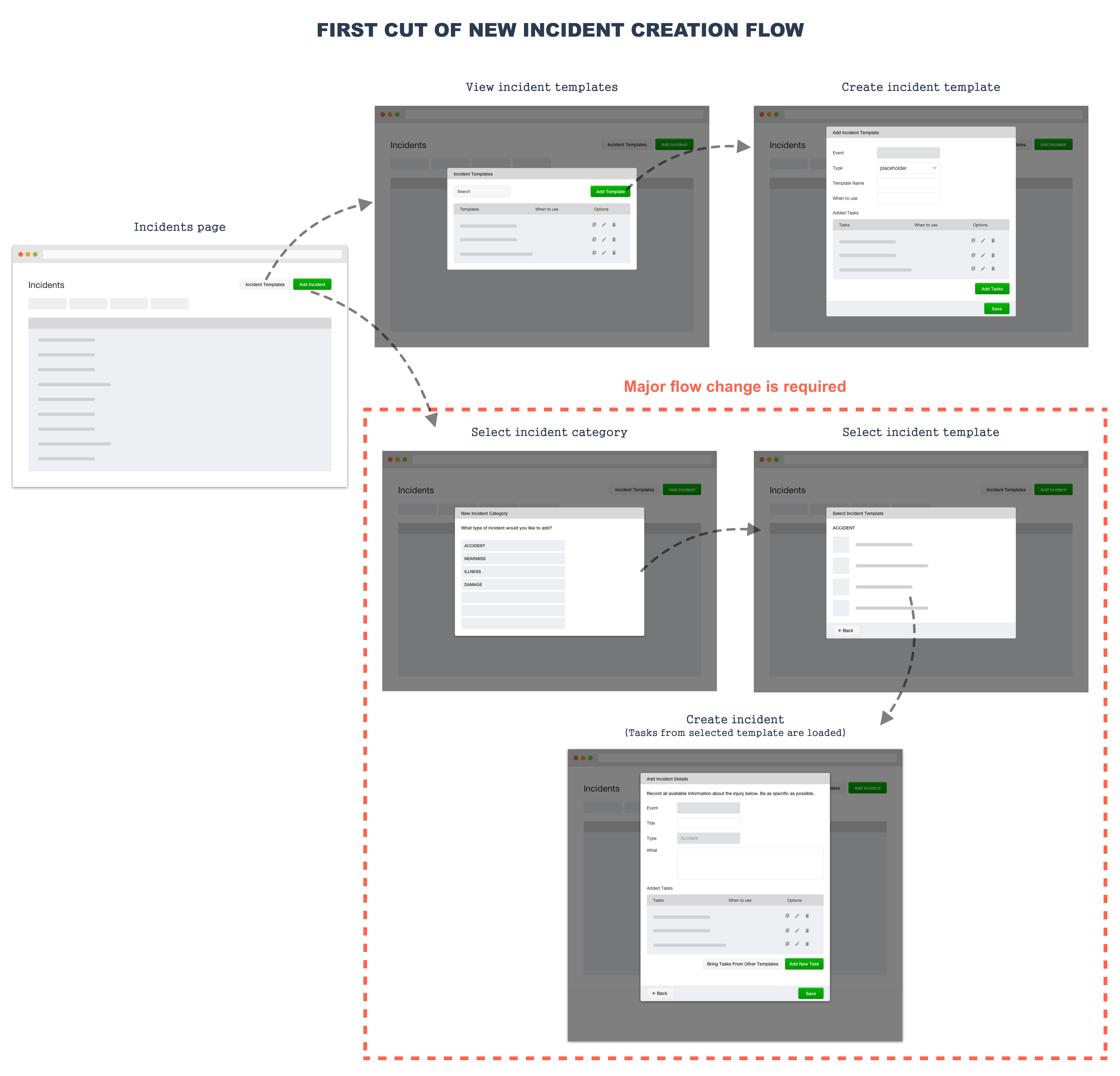
Testing & Iteration
Tested interactive prototypes with a cycling competition incident scenario. Key findings: users enter all info at once in time-critical situations, actions-taken field used only when time allows, and severity needs simpler options (urgent vs not urgent).